RESEARCH:

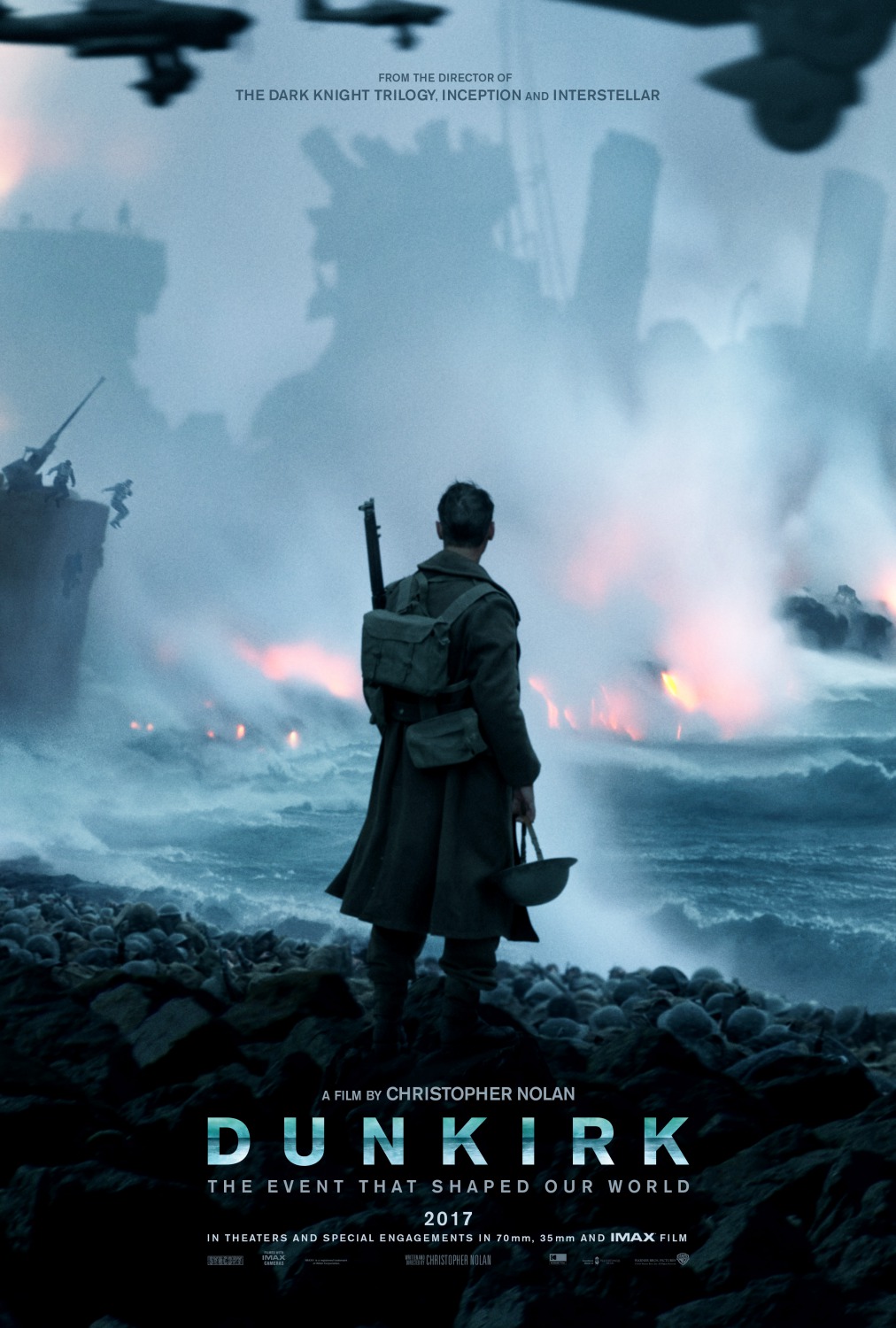
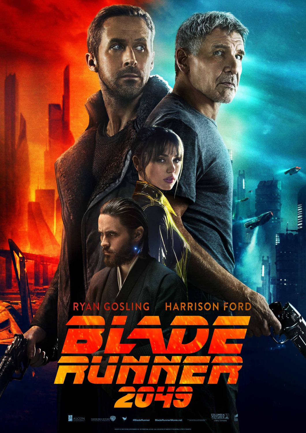
When I began to research ideas for my film poster, I decided to look at several film poster's with similarity in genre to my finished film. As my film is a thriller, several posters for Thriller films such as Gone Girl and Blade Runner 2049 caught my eye. However, the poster for Dunkirk was a big inspiration for my poster due to the dramatic effect of the central protagonist with his back to the audience.

PLANNING:
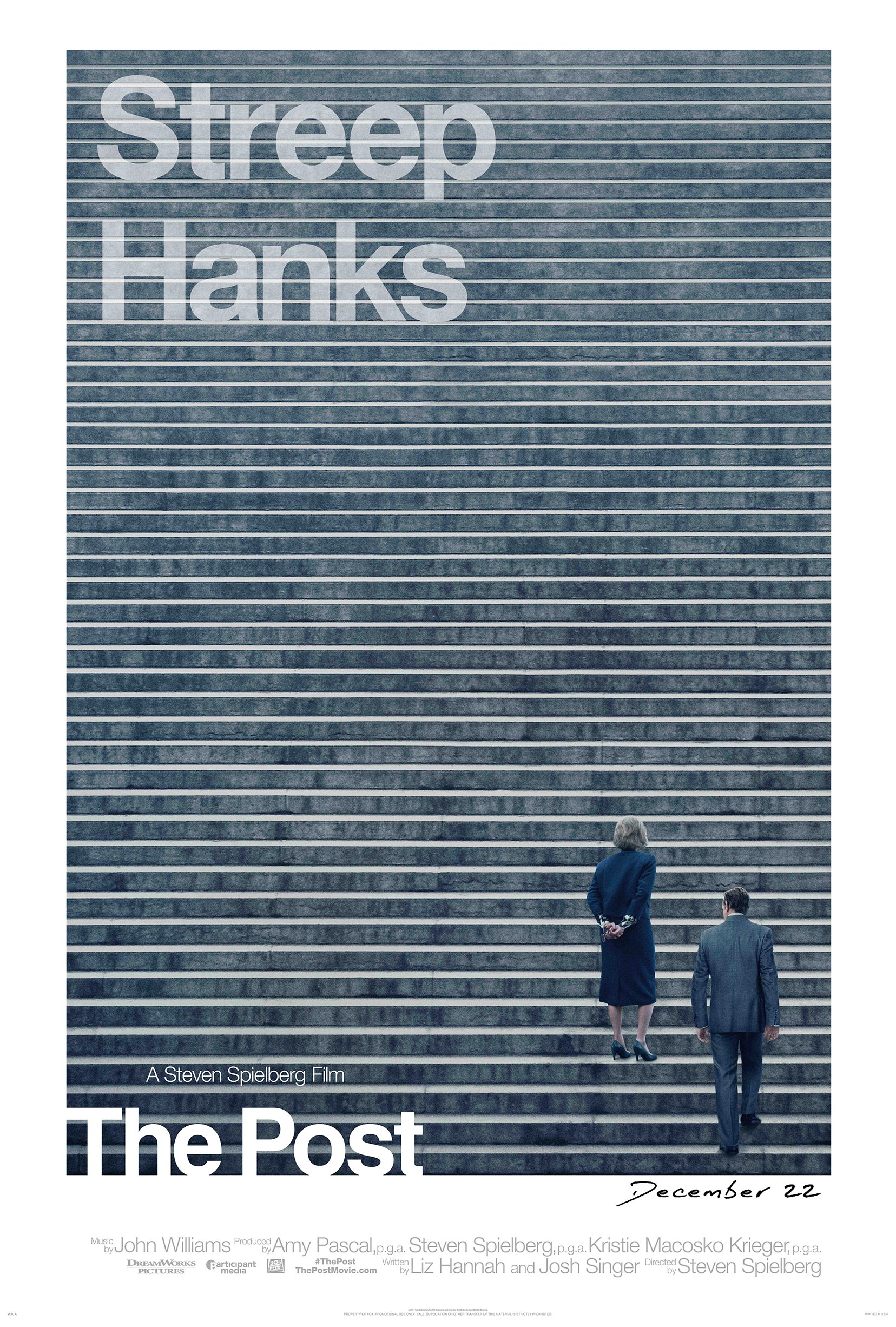
In order to gain inspiration for the film poster I am making for my trailer, I decided to look at several different film posters from different genres that caught my eye. An important feature of a poster is that it should signal the genre. For instance, the film poster for The Post (2017) should be sharp and dark in colour to signal the dramatic tone of the film.
Having looked at these two posters in detail, it has given me inspiration for the poster design for The Damned. My initial ideas for my film poster include a picture of the protagonist and the 'bent cop' standing side by side in the centre with the action of the film (and the existence of the cult) photoshopped into the bottom of the frame to convey two seperate images that are joined together in smooth editing. My main inspiration for this idea came from the posters for both Najaki (2014) and Blade Runner 2049 (2017) These two posters feature similar concepts to the design I wish to create for my poster, which I will be able to accomplish through the use of photoshop.

CONSTRUCTION:
When it came to the construction of taking images for the poster, I did a photoshoot with Matt in costume for my character in order to decide on an image I wanted to use. My poster was initially meant to feature myself and the 'bent' cop but due to time restraints and availability of the actor this had to be changed to a picture of myself in character as PI Andrews solitary in the frame. I decided to frame the picture in a well lit area, with myself standing with my back to the camera with a gun in my hand and a glance over my shoulder into the distance for dramatic effect. We experimented with several different images (as seen below)


I also decided early on that I wanted my poster to feature a flame type design so I took various pictures of a burning tree for inspiration, which I later decided to photoshop into my existing picture. When it came to my editing I felt that the two pictures flowed very well into one another, and to finish it off we took another picture of the runes used for our set in the trailer in order to tie the poster into my film.
EDITING:
After having taken the required pictures for my poster I went into photoshop to begin editing them together. I had to crop my figure out of the location background and started working from there. I further cropped the image of the fire out of the background. After gaining inspiration from posters for The Girl Who Played With Fire (2009) poster, I managed to create a smokey splatter effect on my posrer by imitating the right side of PI Andrews burning and fading into the background. This was a very time consuming process which involved creation of over 4 similar layers and liquidification of the image. I then had to create masks for two layers and go over the liquidification with a black and white brush to create the scatter effect. To finalise this, I went over the scatter with different shades of orange to solidify the poster into the image of the fire.
After having successfully blended the three pictures, I added the final touches by downloading a billing block font and adding the release date at the bottom and the two main cast members into the top. When zooming into the poster I realised that the scatter effect looked very blurry and low resolution, so to combat this I zoomed in and went over the effect with a very small black brush which ended up making it look far more detailed. The finished result can be found below.


After having finished my film poster and working on the feedback I recieved, I was able to analyse my film poster in the same way that I analysed the film posters for their poster conventions earlier in the research stage. This was extremely helpful as it enabled me to view the strengths of my poster and how it compares to other, professionally made film posters. It also enabled me to further appreciate the work and the symbolism it involves, with the fire and the runes being a high point according to my peers.


Superb work, Tom. You have researched carefully and there is a clear link between research and outcome. Your poster is most arresting, with the power of the main splash and its dynamic, arresting image. You signal genre clearly with the gun (featured prominently) conveying jeopardy and crime as well as the visual codes of the engulfing flames of fire, dark colours, runes and symbols.
ReplyDeleteThere is careful creative branding achieved though title font choice
This makes for the promise of the successful cohesion of promo package, with the principal actor the centre of visual interest in trailer, poster and magazine cover.